Voyage

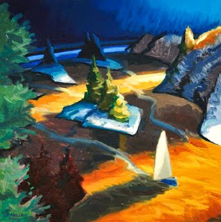
Philip Koch, The Voyage, oil, 18 x 18"
This is a small painting I made in preparation for a major studio oil. It's in a group exhibition Waterscapes at the Nichols Gallery in Barboursville, VA right now. I was looking at it on their website and really enjoyed seeing it again. It is I feel, an original painting.
This is an invented painting in the sense I dreamed everything up. But every aspect of it depended on the hours I've spent looking at boats, bays and shores, things that were prominent in my young life. And equally dependent on pouring over some work from artists who've gone before me.
I actually had an autobiographical idea in mind when I first started cooking this painting up. An image from my childhood that always stays with me is the little single sail cat boat my father bought when I was about eight. He took me sailing often and taught me how to navigate the thing on Lake Ontario. He was a slightly reclusive and profoundly taciturn man, and wasn't the sort to hang out with his kids. But he did find time to take me sailing with him and this meant the world to me. He died when I was thirteen, but the memory of that boat is tightly wrapped up with my strong longing for him. Naturally I had a storehouse full of emotions swirling around the idea for this painting I hoped to do.
But strong feelings don't tell you how they should be painted. That you have to come up with on your own. Fortunately, there is a language of painting that developed over the centuries for dealing with such thorny challenges. You can , and probably should, borrow a lot.
Let me focus on just one aspect of this composition- the way the boat feels like it is coming closer. Three basic tools I borrowed from art history help me make that sense of change and movement palpable.
First, the light shines into the painting from the right hand side of the picture. This provided me an excuse to cast long, roughly horizontal shadows across the water. At intervals, they divide up what would otherwise be a too continuous surface of the water. Just like the white yard lines drawn on a football field, they help the viewer measure his or her progress from back to front.
Second, I've employed the device of overlap. Look at the light sail of the boat reaching up and covering up just a bit of the dark shadow that falls across its wake. Or the way the vertical dark blue trees on the most distant island overlap the bluish highlight on the water in the very far background. Overlapping forms show you who is in front of who. Artists consciously have design the placement of their forms to build space this way. I really learned about this by looking at 17th century landscapes by Poussin and Claude Lorrain, neither one on my list of favorite artists, but great teachers nonetheless.
And the colors of the front, middle and back spaces are each distinct. It's warm up front. It's the opposite in back. This sort of exaggerated color shifting between the major planes in a painting is something I picked up from late Renaissance landscapes. But the vividness of my color choices depended more on my excitement at the intense colors of artists like the 20th century painter Georgia O'Keefe.
Painting is hard enough without reinventing the wheel. You are in the business of expressing some of the most elusive of thoughts and feelings. To do that you have to take advantage of some of the grammar and vocabulary of the artists of the past. It would be foolishly arrogant to think you can create a new language all on your own. And even if you could, no one else could understand what you were saying.


