Posts

Showing posts with the label art technique

If Plants Could Talk...

Image
Charles Burchfield, Sultry Moon, watercolor, 1959 Burchfield Penney Art Center's Facebook page is worth following. Every morning without fail they post a new painting by Charles Burchfield along with a selection of his writing from his journals. Seeing what they are offering up is one of the high points of my mornings. Sultry Moon  above was their pick this morning. It was new to me and as I looked at it the phrase "If plants could talk..." went through my mind. Burchfield is a very different kind of landscape painter than I am, but one thing I admire in his work is how remarkably  animated his forms are. Much of the energy he injects into his paintings is built out of his mastery of brushstrokes. This guy knew what he was doing.  Just to say two things about his mark-making: -You never know ahead of time what direction his brushstrokes are going to take as he paints his forms. Always he's surprising us. Unconsciously that makes us want...

Painting's Problems Are Just Like Life's Problems: What to Do

Image
Edward Hopper, The Camel's Hump , oil on canvas, 1930 Munson Williams Proctor Arts Institute, Utica, NY. This painting was made the first summer Hopper spent on Cape Cod. He worked from the spot where four years later he would build the painting studio he would live  in for the next 30 years. It's my favorite Hopper  landscape Yesterday I was finishing a painting of a tree in a large painting I began last week. The session started out well. In my mind's eye I could see the tree looming magnificently above me in a brilliant morning light. Incredibly rich yet somehow elementally simple. As I pushed further, layering the brushstrokes to evoke the wonderful volume and intricate surface thousands of glistening leaves make. But it began to go wrong. The commanding personality of the tree melted away into an undistinguished mass of oily dots. An inner voice told me to put down my brush and get out of the studio before I made th...

What I Learned from My Ink Wash Drawings

Image
Philip Koch, The Trees, sepia, 30 x 42", 1985 All of us are on a long journey. Who we are today is the product of sometimes amazingly contradictory influences. For an artist every medium they employ offers them a different lesson.  I was in my painting storage room organizing work for my upcoming solo exhibition at the Washington County Museum of Fine Arts (Nov. 8, 2014 - Feb. 22, 2015).  I stumbled upon four of my large ink wash drawings, snugly resting in the painting racks. That was enough to spin me off into reminiscing how they played a decisive role in my growth as a painter. A little history:  When I first began painting I was attracted to the geometric abstractions of the 1960's and painted with big flat shapes of intense acrylic colors. As I reached grad school at Indiana University I unexpectedly fell in love with the University Art Museum's 19th century landscape paintings. They propelled me into a darkly moody world, with me painting in o...

Edward Hopper v.s. Thomas Kinkade- Who's The Painter of Light ?

Image
Edward Hopper, Rooms for Tourists, oil, 1945 An oil painting by Thomas Kinkade One of the best reasons to look at art is it teaches us how to enjoy our eyes. Paintings are always lessons in seeing. Really good paintings simply help you have a lot more fun.  Thomas Kinkade, probably one of the best known American artists and certainly one of the best marketed, passed away in the spring of 2012. Kinkade called himself "The Painter of Light", a slogan that had a certain ring to it. Kinkade's ubiquitous images are likely some of the first paintings most Americans were likely to have stumbled across. But if one keeps looking, there are probably other artists who have a great deal more to say to us about painting light with real authenticity. Longtime readers of this blog won't be surprised if I offer Edward Hopper as an alternative. Comparing the two landscapes above is revealing of some of the deeper essentials of painting.  If painting is primaril...

Which is More Important: Color or Drawing?

Image
      Philip Koch, Morning: Acadia, vine charcoal, 10 1/2 x 14", 2013 My title asked a trick question. One for which there is no answer. To me there's more connection than separation between drawing and painting. Drawing implies leaving a great deal of the surface of the paper exposed, while painting suggests covering over most or all of the ground of paper or canvas. I usually tell my painting students that "painting is mostly drawing," It is an exaggeration I know, but it does get their attention. The most magical thing about painting for me is of course color, as it is for most of us. But color is so powerfully fluid and multifaceted that it can easily elude us. A painting that is only about color would be like trying to get a drink in a parched desert without a cup.  You need a vessel.  Drawing in a great set of shapes "holds" the colors in place for your eyes to drink them in.  Shapes, and by that I mean the flat silhouettes that are the buil...

Edward Hopper's Legacy: Taking His Eyes Seriously

Image
Hopper, House on Middle Street, Gloucester, watercolor, 1924 Currier Museum of Art, Manchester, NH The Edward Hopper House Art Center in Nyack, NY has asked me to be part of the program at their Annual Spring Benefit on Sunday, May 4. There will be tours, music and sparkling wine. I'm going to give a short talk on Hopper's legacy and how he has influenced me and other artists since his time.  The setting of Hopper House will do a lot of the talking for me.  Hopper, far more than many prominent artists of his generation, found his ideas in his immediate surroundings. The Hopper House Art Center, his boyhood home where he lived until he was approaching 30, in many ways was one of the key influences on how he saw the world. Above is one of his watercolors from the Currier Museum of Art . With its rhythm of irregular highlights and shuttered windows it's brimming with quirky personality. I believe that's in part because Hopper was open to seeing its potent...

Washington County Museum of Fine Arts Part II

Image
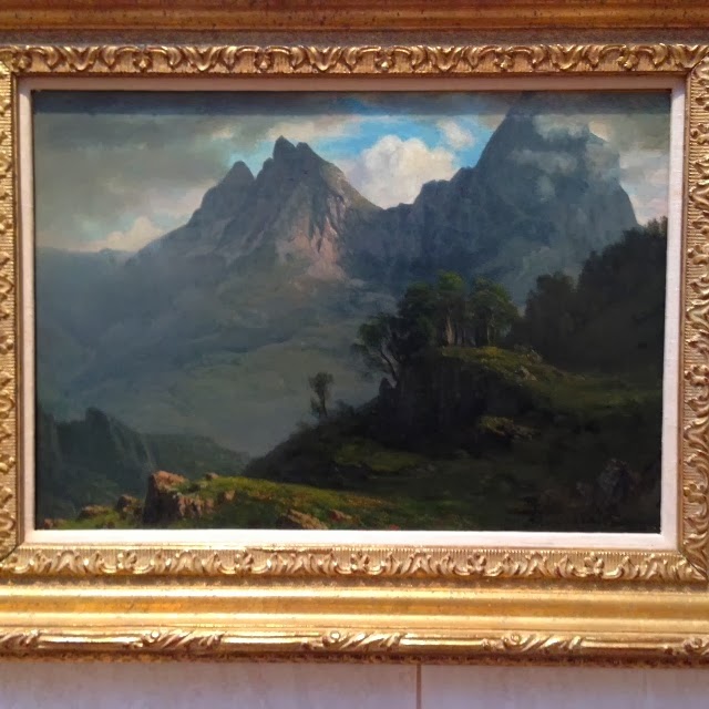
Last week I was out at the Washington County Museum of Fine Arts  in Hagerstown, MD. First time visitors often can hardly believe such a powerful Permanent Collection could exist in such a place.  A few days ago I wrote a blog post about their newly renovated Singer Gallery  and some of the work on display there now.  Couldn't resist mentioning a few pieces hanging in the adjoining gallery in a show from the Museum's Permanent Collection.  Above is a stunning small oil on paper by Albert Bierstadt (American born in Germany 1830-1902), In the Rockies . Probably painted mostly from direct observation, Bierstadt's oil shows us a masterful use of silhouetted mountain peaks for  emotional impact. The artist tones down all the contrasts in his warm colored foreground, urging us on as our eyes scale the crisply etched cool bluish cliffs. Bierstadt tells you where he wants you to look. Thomas Cole (Am. 1801-1848) Study for "The Voyage of Life...

Unlikely Friends: Hopper & Burchfield

Image
Edward Hopper (Am. 1882-1967) Charles Burchfield (Am. 1893-1967) On the surface the paintings of Charles Burchfield and Edward Hopper look very different. I feel they were both chewing on the same bone, but from opposite ends. Much of what I do as a painter myself owes a debt to the lessons I've gleaned from studying their work. Burchfield's often over-the-top exuberance is always tempered in each painting by a conscious pulling back. He loved laying down networks of patterned strokes, but he knew just when to stop. His   watercolor below bustles with energy. The three building couldn't look more different. To that he adds conflicting patterns in rippling water, spindly tree branches, and powerlines. Yet how careful he is to include quiet and empty passages in the water and sky. Burchfield, February Thaw , watercolor, circa 1920 Brooklyn Museum of Art Without these quieter places where we can rest our eye we would find his paintings ov...

Philip Koch Work in Studio Visit Magazine

Image
Above is the two-page spread on my paintings that appears in the new Volume 24 of Studio Visit  magazine. Given that these two of my favorite paintings are reaching a broader audience I thought it would be good to tell a little more about them. In this post I'll take up the first one. Inland , oil on canvas, 45 x 60", 2008  at George Billis Gallery, New York The forests of inland New England are really dense. So much so that I often resort to searching out the clearing provided by a beaver pond so I can see more of a vista. In the early days of American landscape painting small farms dotted New England. Painters of the Hudson River School like Cole and Church could set up their easels anywhere and likely find a panoramic view without too much trouble. That all changed with the expansion of mechanized agriculture in the Midwest. New England's rocky soil and hilly sloping fields made the going harder. A lot of New England farms failed and their...

The Delicious Sugar Maple

Image
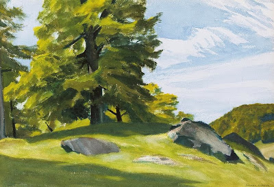
Sugar Maple, watercolor, Edward Hopper This Hopper was up at auction this last week (I didn't buy it). Found myself thinking about it and going back to sneak peeks several times over the last few days. There's its dazzling sunlight. Nobody paints bright sun better than Hopper.  But he's also a master on other levels. For me one of the delights is the feel of his pigments. His paint is gracefully pulled over a smooth grassy hillside. But Hopper uses a more agitated brush describing the textures in the maple tree. Hopper is so good he gets these radically different surfaces to complement each other. Robert Barnes, one of my painting teachers in grad school once told me you knew a painting was good if you found yourself wanting to taste the paint. This one looks pretty appetizing.  There's a mystery to paint surfaces. They can entice you in extremely different ways. Some artists make them dry and chalky. Others go for a more fluid look, rapidly drawin...

Little Lies

Image
                    A 1914 watercolor by Edward Hopper. As I was out this morning I was struck at the remarkable complexity of what we usually see in the world. Honestly it's a bit overwhelming to the eye, which is why we wear mental blinders most of the time.  Artists give us energy by creating an "alternative universe" that is quietly simpler than reality. When it's done right, viewers are too busy drinking in a painting's energy to notice. In the watercolor above for example, Hopper paints what in real life was a maddeningly busy rocky foreground. He radically edits out much of the detail (the bleached-out immediate foreground). He prunes it down, adding a powerful wind to the painting's sails.   Inland, oil on canvas, 45 x 60" at George Billis Gallery, New York My own painting above also delivers a simpler reality. Its focus is the contrast of the vertical stripped-bare tree trunks again...