Posts

Showing posts with the label color

Colors of June / Colors of September

Image
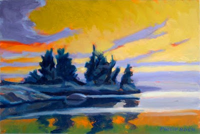
Philip Koch, Warm September, oil on panel, 14 x 21inches, 2020 Art expresses the emotions painters have about their subject. Sometimes though it's the opposite.  This is my painting Warm September  that is at Somerville Manning Gallery in Delaware.  I started the piece by painting with mostly verdant green colors over three hot June afternoons. To be honest it was sort of weather that starts you longing for a crisp Fall day.  Later back in my studio I gave in to that fantasy and changed the calendar on that painting to a more temperate Fall day. Liked the result a lot. This was the second painting I made from that spot. I'd found this subject when I came across a lovingly maintained split rail fence at the side of a field in East Aurora, NY. This  was an area the fanciful painter Charles Burchfield favored for his own landscapes (I was the Artist in Residence for   the Burchfield Penney Art Center in nearby Buffalo from 2015-18).  Here ...

Which is More Important: Color or Drawing?

Image
      Philip Koch, Morning: Acadia, vine charcoal, 10 1/2 x 14", 2013 My title asked a trick question. One for which there is no answer. To me there's more connection than separation between drawing and painting. Drawing implies leaving a great deal of the surface of the paper exposed, while painting suggests covering over most or all of the ground of paper or canvas. I usually tell my painting students that "painting is mostly drawing," It is an exaggeration I know, but it does get their attention. The most magical thing about painting for me is of course color, as it is for most of us. But color is so powerfully fluid and multifaceted that it can easily elude us. A painting that is only about color would be like trying to get a drink in a parched desert without a cup.  You need a vessel.  Drawing in a great set of shapes "holds" the colors in place for your eyes to drink them in.  Shapes, and by that I mean the flat silhouettes that are the buil...

Ghastly Music

Image
Years ago we lived near a house where an eager teenage garage band of five boys would practice daily. Actually they weren't that near, they just played really loud. At 200 yards you couldn't miss their distinctive sound. Each of the five was determined to take the lead all the time and would amp up their part trying to drown out the guy next to him. You had no idea what parts were important and what was supposed to be the backup. They were just awful. I had to paint with the windows closed to stay sane. Above is the new large oil I'm including in the upcoming Sabbatical Exhibition  at the Maryland Institute College of Art's Dec.1- 18. It's Horizon, oil on canvas, 40 x 60." Begun last summer, I had it all blocked in with the initial layer of paint completely filling the canvas. Then I had to turn to other paintings to complete them for other shows and only returned to this canvas a few weeks ago. So it rested in my basement art storage racks for a few months. ...

Georgia (O'Keeffe) on My Mind...

Image
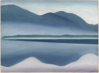
Why do some artists become household words and others linger in obscurity? Some months back I wrote about the intriguing but now little known American painter Elizabeth Sparhawk-Jones (1885- 1968. You can read about Sparhawk-Jones on my friend Barbara Lehman Smith's  website). Sadly Sparhawk-Jones' ascent in the art world was derailed for decades by her struggle with mental illness. Once considered one of the people to watch in the art world, her reputation is only now coming back out into the daylight.  The far better known Georgia O'Keeffe (1887- 1986) came to prominence a few years later than Sparhawk-Jones when O'Keeffe became romantically involved with the older wealthy American photographer Alfred Stieglitz. Stieglitz was prominent in modern art circles and had the financial resources to champion her work. I've often wondered if we today would know O'Keffe's work as well had she not become entangled with the famous older photographer. Personall...

Learning to Speak Dutch

Image
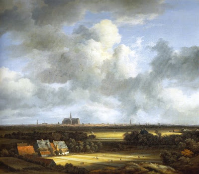
When I was just beginning my journey to become a painter I was enrolled at Oberlin College. At the time its Art Department leaned somewhat heavily toward conceptual and avant gard art. Eva Hesse came as a visiting artist to give critiques to the art students ( I was the only one who showed up to hear what she had to say). Overall the key message I received studying art there was that the most important goal for an artist is innovation. Art from the past was important of course, but our job was to make a new art that boldly asserted its independence from all those outworn conventions.  Trouble was, I didn't really like my paintings very much. I knew I was ripe for change. I went on to Bloomington, Indiana and entered their MFA program in painting. I took a course in Baroque art from the art historian Charles Hasthausen. He liked landscapes and showed lots of 'em. That's when I discovered I loved the Dutch Masters. And still more important, I realized that whether or not I w...

Making Sense of Color

Image
Above is a new oil painting, Monhegan Dawn: Emerald  I just completed. It's 6 1/2 x 13", fairly modest in scale.  I chose that because I wanted the freedom to experiment with colors that aren't the ones I routinely pull out of my toolbag.  On a smaller scale I'm much more likely to adopt a playful attitude. Working goes quickly so you tend to fall into a "what the heck, let's see what happens if I..." frame of mind. Specifically I wanted to try cool greens for the water's surface and contrast that with cooler violets for the rocks. While neither of these hues was present the day I worked plein air from the location, they evoke a powerful feeling I have about the place.  Color after all is about the chords of two or three hues sounding together. Artists have to paint for years before they do their best work. It takes this long to learn to see chords of color rather than individual colors apprehended one at a time. Below is the vine charcoal drawing ...

Bold Power Hiding in Subtle Colors

Image
There's a slippery quality to color. It's like trying to pick up a buttery noodle off the floor- sometimes you get it, other times it just won't give you any traction at all. Fortunately some very gifted people have wrestled with just such problems and by their example, we can grab and hold on. Above is an oil by Sanford Gifford, The Wilderness , now in the Toledo, Ohio Museum of Art. It was painted right before the U.S. Civil War. Gifford's basic idea is to conceive of the world as suffused in a soft orange-yellow light. He undoubtedly painted this oil over a warm sienna-colored ground. Most of the painting's surface glows with that warmth as he purposefully allowed it to show through the subsequent pigment layers. In a few places he puts in some relatively cooler colors- mostly a neutral grey. Swimming in the field of warm colors, the greys are the exception. They know their place is to play a supporting role to the dramatic leading role assigned to...

What do gold and silver taste like?

Image
Most of us understand tasting food far better than how to experience art. You only know if you like a food by putting it on your tongue. Nobody puts all their trust in the flowery description printed in the menu. Imagine a tour at art museum where a well informed docent takes a eager group into a gallery and proceeds to tell them at length about the art work that will soon be hung on the gallery's bare walls. No matter how entertaining, it wouldn't be much of a tour. What is a landscape painting? That two word phrase doesn't tell you much at all. You have to look before you decide whether a particular piece speaks to you or not. You simply have to "taste" it. Let me show you two new oil paintings of mine- both with lots of water, islands, and sky. They're both horizontal compositions. And both are lit from the sky. Beyond that they depart radically from each other. Above is Northern Sky , oil on panel, 7 x 10 1/2". It's intimate and it creamy and but...

Different Threads in my Studio

Image
Philip Koch, Northern Sky: Orange II, oil, 15 x 22 1/2" 2010 Philip Koch, Orchard, oil, 16 x 24", 2010 Above are two of the 21 oils on paper I just shipped off to George Billis Gallery in New York. Both were completed this year and are about the same size, but in mood and handling, they couldn't be more different. Let me explain. I've always loved going back into older paintings to see if I can't make them stronger. My batting average over the years of doing this has been pretty good- I'd say well over 90%. With odds like that how could you not keep re-visiting and re-arranging things. At the same time, it's critical that I maintain a sense of forward momentum too. So I like to be working on brand new projects too. As my color sense has evolved over the years towards more intense colors other changes have been afoot as well. I've stopped painting directly from life, preferring to work from vine charcoal drawings I've done outside, or sometimes out ...

Good Times at the Phillips Collection

Image
My wife and I went down to Washington, D.C. yesterday to visit the Phillips Collection, the lovely small museum in a residential neighborhood that bills itself as the first museum in the country dedicated to modern art. We were there to see their Georgia O'Keefe: Abstraction show up through May 9, 2010. It's a collaboration between the Phillips, the Whitney Museum, and the Georgia O'Keefe Museum, where my old friend Barbara Lynes is the Curator. The show is very good and I would highly recommend it to anyone. The Museum guards are told to not let visitors photograph work that isn't part of the Phillips' Permanent Collection, so I wasn't able to show you views of the O'Keefe show. But there is enough other stuff up that there's an embarrassment of riches. It's pretty hard to feel slighted. Above is probably the Phillips' most famous work, Luncheon of the Boating Party by Renoir. French impressionism has been so famous for so long that contempor...

Putting on Your Chef's Hat

Image
Here's an older painting of mine I've always liked a lot. It's The Roof , oil on canvas, 20 x 14" and was painted from life just down the road from my studio in Baltimore. I live in a very hilly section of town and love being able to look down on a roof top. The real engine of this painting is the contrast of warm and cool colors against each other. Obviously the big decision was that the architecture would be cooler than the foliage in the background. The forest in back acts like a giant trampoline that bounces your eye back to the front if you wander too far into the distance. The trick with color is that one has to see many colors at once, much like hearing chords in music. I wanted to keep the architecture always cooler than the leaves, but still vary its temperature vigorously. It's always a question of a color balancing act. Here's the large palatte in my painting studio that I bragged about in my last blog post. One of the secret weapon a painter can u...

Baltimore Museum of Art Visits My Studio

Image
It's funny, my studio is usually the one place I go where there are no other people. Yesterday I had forty some new faces staring at the easel I usually face alone. It was a studio tour organized by the Baltimore Museum of Art's Prints, Drawings and Photographs Society. Led by Rena Hoisington and Ann Shafer, two of the Curators from the Museum, and my MICA colleague Trudi Ludwig Johnson, a printmaker and President of the Society, the group is focusing their program on the pastel medium this spring. They had a morning and afternoon visit to my studio where they asked me to talk about working with this delicate and sometimes marvelous material. Next Saturday, Rena Hoisington, one of the BMA Curators, will be leading a seminar at the Museum on the history of the pastel medium with examples from the Museum's collection. As I told the group, I'm very glad there's a Museum group devoted to looking at work on paper. Too often this branch of the art world gets short shrift...

The Puritans, Stolen Corn, and Using Color

Image
Philip Koch, The Return, vine charcoal, 9 x 12", 1998 Philip Koch, The Return, pastel, 9 x 12, 1998 This is my post Thanksgiving post. There's a famous landmark in Truro, MA on Cape Cod Bay named Corn Hill. The Puritans arrived there from England with their ship's stores badly depleted. Before heading on to Plymouth, MA they went ashore and stumbled into the local Native American's store of corn. Declaring this a gift of Providence (they literally did) they then took the corn for themselves and shortly after headed to the mainland to enjoy further calamities. The name Corn Hill stuck. When I first started having residencies in Edward Hopper's Truro painting studio, I of course started checking out all the sources in the area he painted from. His eye was so sharp you'd be crazy not to. Hopper did a fabulous watercolor or two of the houses on the steep slope of the famous hill. From near the top you can look south and see this marvelous view. A tributary of the P...