Doing Much With Very Little / Rockwell Kent Prints
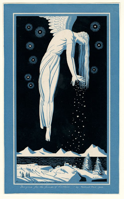
 I posted this Rockwell Kent angel on Facebook on Christmas Eve. Since then I've been looking at it repeatedly and keep noticing amazing little design inventions Kent employed to make it so powerful. He worked in the extremely limited palette of black against white. By some quirky miracle of his creative mind, instead of inhibiting his imagination this seemed to let him soar.Kent pares down art to just clear hard shapes, contrasts of patterned against empty surfaces, and the starkest black and white imaginable. If you want to learn about design, nobody is a better teacher than Kent.In his snow-giving angel above, look at how he divides up the inky black sky. Someone else might casually scatter stars throughout the sky like wall paper. But instead Kent sees the background stars as a means to build surprise into a night sky that makes up 4/5 of his composition. He corrals the stars into just the top of the sky making the remaining emptiness feel more vast and the clustered stars above more dazzling.The angel's hands are particularly effective, opening up like a hinged folded paper fan. See how Kent hints at a circular rhythm of the tinier snowflakes issuing from her fingers. Then they become larger and vertically shower down on the earth. It's his attention to little things like this that lift what could be a maudlin illustration of an angel into something we have to take more seriously. Kent tells us that at least in the realm of dreams and imagination, winter angels bearing snow are absolutely real.
Kent was also a prolific producer of bookplates. Here below are a few examples. They are all little works of high art in their own right. Below a happy reader sits beneath a magical tree whose fruit is more and more books.
Our reader above wears a loose fitting robe. Look at the way Kent echoes the downward thrust of the two massive tree roots with two big upward moving folds in the cloth stretched between his knees.
Here's an modest yet powerful image- a young sapling emerging from the withered remains of a long gone tree. I love the way Kent shines a hard light in from the left side to create a massive old stump. Its clear highlighted and shadowed planes make the old wood feel so solid and heavy. In contrast the new sprouting tree seems diaphanous and almost a spirit more than an earthly plant.
Finally here's a double offering. At the left, a rising sun (or is it setting?) The composition could have been miserably static with old sol smack dab in the middle of the page symmetrically radiating out rays of light. So in comes Kent with a totally unpredictable pattern to the rays. Since you don't know ahead of time what he's going to do with his patterning, you feel like you have to look just to see what's going on.
Kent for many years was virtually disappeared from mainstream accounts of 20th century American art history. I'm happy to see he is finally starting to get his due. And the winners in this are us, who are finally seeing some of the most inventive and heartfelt drawings and prints to be found anywhere. The power of his imagination prods us to enjoy our eyes in ways we haven't before.


