A Dedication to Edward Hopper
I talk about Edward Hopper's work a lot. Partly because I think he's a very exciting painter. Partly because I believe he wasn't the most skillful of painters but found ingenious ways to work around his short comings. And also because he was able to endure twenty years of relative obscurity as a painter while supporting himself as an illustrator (his career is the opposite of a "boy-wonder"). But the primary reason is how his hand changed my life direction so completely.
Early on I'd decided to become a painter when I was in my freshman year at Oberlin College. I spent two years going with the flow of what was being taught in the school's art department- a grab bag of conceptual art, performance, and lots if interest in building irregularly shaped canvases and painting with acrylic paint and masking tape (neatly separated areas of paint were considered critical). It wasn't terrible and I did learn much about color mixing, proportion, and becoming sensitive to a painting's surface. But I wasn't happy. A lot of the classroom discussions seemed to be more about being clever than becoming insightful. Theory seemed to be the cart placed in front of the painting horse. Worst of all I sensed my paintings just weren't very good.
Enter Edward Hopper.
Oberlin has a top notch art library and I found myself spending every evening there paging through various monographs on different artists rather than doing my assigned readings for my non-art courses.
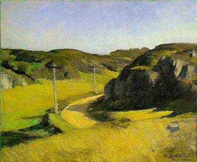
A few books on Edward Hopper's paintings kept calling me back for a second and then a third look. His world looked and felt so much more like the world I knew than anything happening in my studio art classes. As in the wonderful Hopper oil landscape reproduced above, he had a way of combining sharply raking light with the most wonderfully solid forms.
Look at the painting at the top. First of all a painting has to show you something your eye doesn't expect. Few landscapes do that, yet Hopper routinely batted them right out of the park. For example, he made the rock masses at the right super high contrast, very heavy, and unexpectedly cool in color in the middle of a glowingly yellow painting. You might expect more of the same as you move your eyes to the background, but here he pulls the rug out from under your eyes and turns the volume on the rock masses way down. Not knowing ahead of time what he was going to do made you want to look. His ability to orchestrate a richly complex world just seemed to resonate with something deep in my bones. I was hooked.
It's now 44 years later than those evenings alone with those early Hopper tomes. I've just opened my largest exhibition to date of 50 paintings at the Peninsula Fine Arts Center in Newport News, Virginia
(through Oct. 2. 2011). I'm proud of what I've been able to accomplish with this work. But I have to say, without Edward Hopper's sturdy example, I wouldn't be the painter I am today. So, though I suspect he's scoff at the notion, I'd like to formally dedicate my exhibit to Hopper. In a way the work he had to do on this earth ended when he died in 1967. But the work his paintings have to do (they live on with a life of their own) continues as they influence me and probably countless other painters today. Let's raise a glass to Edward!
What follows is a host of photos from the current show and it's opening reception. Pretty much without comment. Above two visitors examine Asecension, 40 x 32", '08.
Here is from the left, Luci Cochran, Director of PFAC, me, Fran Ward a former Board Member of PFAC and the writer who is doing a review of the show for Veer monthly that comes out August 15. And Michael Preble, Curator of PFAC.
A view of PFAC's facility.
Here I am talking with Mike McGrann, Marketing Director for PFAC.
And here's a better photo of the oil seen in the photo above. It's White Light II, 12 x 24", 2010.
Since the show is so large it allowed us to hang far more of my vine charcoals than has been done before. Here's Narrow Cove, Ogunquit on the right and Dawn, Monhegan on the left.
Otter Cove, oil, 44 x 55" at right and North Passage, oil, 45 x 60" at left with a close up image of it below.
This is the newest of the oils, Banner, 40 x 30", 2011.
Eva J. Allen, PhD, the art historian who conceived of the idea for the Unbroken Thread exhibition and wrote the scholarly essay in the show's 92 page catalogue, with her husband Nick Allen.


