Two Big Questions Painters Must Answer
Just like our experience of reality, painting can seem overwhelming. Every artist has to come up with a way of simplifying their compositions without draining away their energy and ability to intrigue the viewer. A way I like to think about it is how they handle two key questions. I call them: silhouette and breakup.
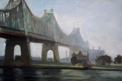
Let's start with silhouette. Hopper's bridge is what I would call a "good" silhouette. Its outer contours are different on the top than on the bottom. This adds a note of surprise as there's almost a disjointed quality as the upper and lower sections of the structure come together. He paints all of it, both steel and concrete, in the same soft brown to grey hues to hold it all together visually. Restrained as it is in color, it's remarkably powerful.
So too with the Mondrian below:
Mondrian's drawing focuses on the camel's hump like arc of the tops of the trees as they bend up and almost touch the top the page. This arc idea is then flipped around in the foreground to make a hammock like curve reaching down to touch the bottom of the page. You see in the tops of the the far trees on the horizon the same hammock like curve again pointing down. Like Hopper, Mondrian starts out looking for expressive action in his largest silhouettes.
But, and it's a big but, neither artist stops there. Mondrian goes back into his shapes and breaks them up differently at the bottom and the top halves of his drawing. The foreground marsh grasses (I think he's showing us a grassy field) are rendered purposely smooth. His top half contrasts that dramatically, looking something like we are peering through the teeth of a comb, but one where the "teeth" have withered into the pencil thin lines he draws for the tree trunks.
Going back to Hopper, you see he too starts by searching for his big, solid set of silhouetted bridge forms. Then he goes back into the bridge's steel girders and breaks them up just at the very far left by adding a half dozen tiny holes where you can see through to the sky.
Try an experiment on the Hopper bridge. Take one of your fingers and cover over just that little section of the upper left bridge with those "sky holes." See how suddenly the massiveness of the bridge turns from something moody and impressive to something heavy and dull. The bridge without those little holes breaking it up feels oppressively monotonous.
When I am painting I try to concentrate of these two questions- powerful silhouettes and then the break up of some, but not all, of their interiors. With practice a painter gets better and better at answers to meet both of these imperatives. It's our way of dancing around the whole issue of too much complexity v.s. too much simplicity.


