The Subtle Power of Gradation

My daughter Louisa was joking around with me the other night. She was planning to take a bunch of her students to the Walters Art Museum in Baltimore and she asked which of their exhibits I would recommend. Pausing a bit she said "of course ever since I was little you and my mom have been brainwashing me that all abstract art is bad." Ribbing me, she wondered aloud if my advice should be trusted. Naturally I was bowled over by this unanticipated accusation and took awhile to pick myself up off the floor and remove the sharp arrow that had pierced my heart. Could I really be that narrow?
It is true my heart lies with the realist painters most of the time and long time readers of this blog know I talk about the Hoppers, the Rockwell Kents, the Winslow Homers, and the like way more than I do contemporary art. But my rebuttal of the charge I'm biased against abstraction (much less against current concept driven art) would of necessity be pretty short. One thing in my favor is I used to be an abstract painter in my early days. And a concluding argument I could use before the jury happened just the evening before. As I was thumbing through the latest issue of American Art Review magazine, I was stopped in my tracks by a particularly lovely oil by Lyonel Feiniger (German-American painter, 1871 - 1956). And I showed it to my equally accused wife Alice who burst out with "Hey, that's really nice!"
Why Feiniger? He's an artist who does a lot of things right that I deeply value in painting. I like strongly stated silhouettes first of all. I figure if you can design a painting that arrests the eye even when it's only at the stage of establishing flat shapes you're likely pull off an exciting painting. In the Feiniger above and below you can see his chiseling out clear and hard straight lines on his unexpected flat forms. He's very good at finding personality in just flat shapes.

The other big reason I like Feiniger more than many early 20th century American abstractionists is he held onto the wonderful tradition of the landscape wrapped in dense, swirling atmosphere. While Feiniger always shows his cubist roots, he had a natural affinity for gradating his tones. In the oil above it's pretty hard to find a surface that isn't gradated. And he delights in varying the edges of his shapes from sharp to softly indistinct. To me gradations in a painting always call up the passage of time, changing light, and shifting weather. There is an emotional tone that creeps into a painting when not everything is clearly layed out and spotlighted.
That is exactly the tool box that back in the mid 1600's Rembrandt reached for in his moody and often mist laden landscape reveries. One of my favorite is his windmill painting below.
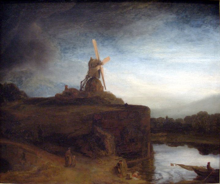
Rembrandt has turned up the volume on his atmosphere and deep space way beyond anything Feininger wanted to try, but Rembrandt spoke Feiniger's language of finding expressive flat shapes. Look at the drama of contrasting silhouettes between the spear like doused sail in the little boat in the right foreground and the massive almost rectangular cliff where Rembrandt errects his windmill tower. Here are two forms that couldn't look less alike, but the painter cajoles them into joining together in a conversation. (Oh heck, they're doing more than that, they're singing together the most beautifully melancholy song, but to say that makes me sound obscessed by the old masters. Still one could do a lot worse).


