Going Ice Skating with Charles Burchfield

One needs to see paintings in two opposing ways.
A painting is always a window into space- sometimes deep space and sometimes shallow. But almost never is a painting's space truly flat. Pictorial space draws a viewer into the painter's imagined world. It's a good thing.
But carving out the space of a canvas alone can be a one-way ticket from the painting's foreground to its far distance. That alone is never enough to keep a viewer with you. So you have to add the other big ingredient- an elegant design to move the viewer's eye around the painting's surface.
When I was a kid there was a neighborhood pond just over the hill from my house where all my friends would gather to skate in the winters. Maybe because I was never very good at the activity I found lots of excuses to sit on the sidelines and watch. I remember so vividly the sound skate blades made as they cut across the ice and the amazing geometry of the tracks they left behind. Some of my friends were excellent skating athletes and composed intricate networks of interlocking spiral lines in the ice. It was captivating. And it served as a wonderful introduction for me to the world of composing and decorating a flat surface, whether ice or a stretched canvas.
Here are three watercolors by one of my favorite artists, Charles Burchfield. In the second half of his life he lived in Buffalo, New York, just over from my skating pond in the nearby city of Rochester. But it wasn't until after he died in 1967 that I became aware of his work. (Burchfield by the way and Edward Hopper knew each other and admired each others work).
In the watercolor at the top of this post you see Burchfield painting in the shadows in the big tree at the upper left. They look to me like giant whales intent on swimming to the left and the right. That's Burchfield's intention- to propel your eye across the painting's surface. He does create a simple shallow space by overlapping forms in front of each other, but the big emphasis is on activating the flat surface of his paper.
Burchfield's watercolor below is a perfect example of one of his other key tools. He creates networks of little dots and squiggles that energize large parts of his otherwise flat planes. But then right next to those busy areas, he'll give you an empty and quiet surface to let your eye rest.

In Burchfield's watercolor below try an experiment with me. Hold your hand over just the bottom half of the painting to block out the empty snowy field. The remaining top becomes a hopelessly jumbled tangle of competing lines that quickly just tires your eye out. But when you drop your hand away the busy top becomes elegant and orchestrated once again.

Painting depends so much on the artist playing off opposites. Flatness against deep space. Busy against empty. Making a painting comes down to discovering a successful balance point between these qualities.
Burchfield leans more towards the active surface and a shallower space than an Edward Hopper or a Winslow Homer.
When I entered my Master of Fine Arts program at Indiana University in 1970 I met a student printmaker who was a nut on Burchfield. His enthusiasm was infectious and prompted me to start looking at his favorite artist more actively. Some dismissed Burchfield as "too cartoon-y", but to me his outrageous over-the-top watercolors expressed some of the radicalism that I myself was finding when I went out to paint plein air oils. Nature seemed wilder and less predictable the more I looked at her. I remember once commenting to one of my artist friends upon returning from an outdoor painting session that "I think Nature is on drugs."
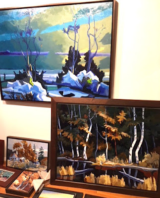
Below is a painting of mine from just last year, Deep Forest Pool, oil on panel, 30 x 40" that's now on display at the Peninsula Fine Arts Center's show of my work (through Oct. 2, 2011) in Newport News, Virginia. It's done entirely from my imagination, stoked by memories of my years spent growing up in a deep forest near Rochester.

It's a piece that owes a debt to Burchfield. The highlights on the white birch trees on the far shore have been lightened up considerably while the highlights on the surrounding foliage have been darkened. This puts the spotlight onto the flat silhouettes of the white trunks, each bending this way and that as if they're dancing to some private music. Trees really look like this when you open your eyes to them. They are wilder creatures than we usually think of them.
One of the big purposes of art is to help us see more and see more deeply. Burchfield helped me.