Learning to Look with J.W. Waterhouse
We are born, we live, we die. While we are here it just makes sense to try to genuinely be alive. Surely that means learning to enjoy our senses to the fullest. Fortunately there's a crash course in just that available free- looking a great paintings. Let's check this one out.
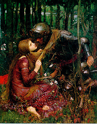
Here J.W. Waterhouse (British, 1849 - 1917) gives us a beautiful woman who seems to be ensnaring a noble knight and keeping him from this knightly duties. This could be a cheesy illustration you'd glance at once and then lose all interest in it. But instead it has a lingering and smoldering intensity to it. That's Waterhouse's art working its magic on the viewer.
Notice how Waterhouse divides up his canvas into a warm overall color in the bottom two fifths of the painting and a cooler, darker zone in the remaining top area. The red haired woman in the red dress seems to literally grow up out of the ground. Similarly our errant knight seems right at home as he leans forward from the cooler dark greens of the background. What the artist is doing is setting the stage for his action. He knows that if you are to be moved by the action in his painting, his figures have to act in a space that itself is expressive. And it is.
This is going to be a story about a woman engaging a man, of the world of the feminine meeting the world of the masculine. (Jungian psychologists have a field day with this painting). So Waterhouse makes the field and the background active players by counter posing their colors against each other. He goes further, surrounding the woman with an organic and decoratively patterned network of leaves and blossoms. The man in contrast, emerges out of a forest of repeated straight vertical tree trunks. It is the artist's way of making the contrasting areas feel different.
After setting up these opposite qualities in the two worlds of his painting, Waterhouse then pulls them together. Most obviously the woman reaches out and wraps her scarf or shawl around the knight's neck (or is it her red hair?) to draw him to her. Note how the gesture of the scarf makes a hard and sharp straight diagonal line that's one of the painting's focal points. Then look over at the knight's knee and ankle at the right. You realize the artist has carefully posed the man's leg to express exactly the same diagonal trajectory across the painting's surface. In his way, Waterhouse makes the two figures' forms begin to dance together.
Admittedly, there's a lot of detail in this painting, yet the artist weaves it all together so skillfully that it reads as sensuous and rich rather than cluttered and distracting. One of the key tools is his pattern of tones (darks and lights). Like many artists of his time, Waterhouse imagines a world where the basic tone is a middle grey, and he begins his painting by covering its entire surface with this. Then he would gradually add lighter and darker notes, inching his way forward until he had just enough but not too much tonal contrast. Squint your eyes at the piece and you realize how the vast majority of the highlights in the painting (for ex. the shine on the knight's gleaming armour) are actually held down into the light middle tones. A weaker painter would have peppered the whole canvas with garish bright highlights everywhere. Waterhouse instead is a master orchestrator, giving us high contrasts just in the most critical places. It's as if he stands up in the balcony directing a spotlight on his stage first here then there to show us what he knows are the key shapes in his story.
Waterhouse is using his heightened visual powers to help our own eyes wake up and see reality on a higher level. For this I'm always grateful to any of the great artists of the past- they help me and anyone else who's willing to look become a little bit more alive.


