Posts

Showing posts from August, 2011

What I'll Tell My New Art Students On the First Day of Class

Image
Philip Koch,  Edward Hopper's Beach, S. Truro, MA,  vine charcoal, 9 x 12", 2006 I teach two classes a week at the Maryland Institute College of Art in Baltimore. It's a large art school ("America's oldest continuously degree-granting College of Fine Art"). PAFA up in Philadelphia is older, but we can claim Abraham Lincoln giving his second inaugural address at MICA, which is pretty cool. Every summer brings to an end a period of intense painting activity for me, a time when I do a lot and speak little about it to others. It's my annual "monk" period. This is good for it clears my head and allows me to think afresh about what I want to say to my students on the first day of class.  This Fall I'm teaching Life Drawing and an introductory Painting class. Both are required classes and always have a few over twenty students. I love teaching these offerings because I believe they offer perhaps the greatest potential to genuinely help young

Paul Revere's Painting Secrets

Image
Years ago whenever I used to gather 35 mm slides to show my classes at MICA from the school's Slide Library I'd fall into gazing at a big poster of this painting by Grant Wood that was hung on the Library's wall. It's of Paul Revere's famous ride to warn of the approach of British troops outside Boston. In a lot of ways it was my real introduction to Grant Wood as previously I'd only known that American Gothic double portrait that's reproduced everywhere. As I didn't really care for that famous painting, I was surprised how much I felt drawn to this narrative from American revolutionary history. What I was feeling I now realize was the expressive power of Wood's talent. He was making  me want to look at his picture.  A really good painting has to first of all delight the viewer's eye with visually surprising and sensually convincing delights. It's gotta look good. Wood's painting does by employing many skillful moves. L

Grant Wood and Me Down on the Farm

Image
Though I'm originally from upstate New York, I spent some six years in the Midwest starting when I was 18, first in Oberlin, Ohio and then in southern Indiana in Bloomington. And it was in the Midwest I became first a young artist and then a landscape painter. Looking back I'm amazed how much learning I managed to pack into those years. And I made great friendships there as well. So perhaps my past predisposes me to like some of the painters who sprang from the Midwest. One in particular is Grant Wood.  Farming dominates and leaves an unmistakable imprint on the people living there. Grant Wood grew up in Cedar Rapids, Iowa and turned his sharp eye on the rhythms of planting and harvesting. He along with his Cedar Rapids compatriot, the artist Marvin Cone, turned the seemingly commonplace agrarian world into something almost mythic in their paintings. Their work has in it's own way the grandeur of the 19th century Hudson River School painters or the later nearly abstrac

Veer Magazine Article on Unbroken Thread Exhibition at Peninsula Fine Arts Center

Image
I just received this article that appears in  Veer  magazine's August 2011 issue from the Hampton Roads area of Virginia. Written by Francis Ward, it captures so much of the spirit behind my paintings that I thought it would serve as a perfect blog post in itself.  Philip Koch, Otter Cove, oil on canvas, 44 x 55", 2008 VEER MAGAZINE August 2011 ART SCENE (EXHIBITION) SOMETHING DEEP AND TRUE Contemporary landscapes of Koch stir the imagination at PFAC by Fran Ward It’s a moment of perfection! Standing in a gallery among landscapes by Philip Koch, we can slow our pace, come to a complete halt and breathe a sigh of relief. We’re here now! That’s all that matters. The art of Philip Koch has provided us a beautiful respite. There’s more to Koch’s landscapes than meets the eye in “Unbroken Thread,” an exhibition of Philip Koch’s contemporary watercolor landscapes at the Peninsula Fine Arts Center through October 2. Timelessness is central to Koch’s works. Each picture is a

Georgia (O'Keeffe) on My Mind...

Image
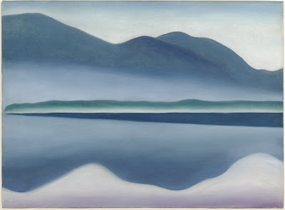
Why do some artists become household words and others linger in obscurity? Some months back I wrote about the intriguing but now little known American painter Elizabeth Sparhawk-Jones (1885- 1968. You can read about Sparhawk-Jones on my friend Barbara Lehman Smith's  website). Sadly Sparhawk-Jones' ascent in the art world was derailed for decades by her struggle with mental illness. Once considered one of the people to watch in the art world, her reputation is only now coming back out into the daylight.  The far better known Georgia O'Keeffe (1887- 1986) came to prominence a few years later than Sparhawk-Jones when O'Keeffe became romantically involved with the older wealthy American photographer Alfred Stieglitz. Stieglitz was prominent in modern art circles and had the financial resources to champion her work. I've often wondered if we today would know O'Keffe's work as well had she not become entangled with the famous older photographer. Personall

The Wadsworth Atheneum's Edward Hoppers

Image
What's this detail? I won a contest! Last time this happened I was about six and won five dollars for my "Space Robot" costume ( a cardboard box with pipe cleaners for antennae) in my town's annual 4th of July parade. This time around I've won a membership to the first public art museum in the U.S., the Wadsworth Atheneum Museum of Art up in Hartford, Connecticut.  The Atheneum has a cool history. It was built in downtown Hartford on the site of the Daniel Wadsworth family mansion with funds from that family and holding lots of their original collection. Their main building is a medieval looking castle (if you're going to be the oldest art museum why not look the part? Perhaps Susan Talbot, their Director, might consider jousting tournaments as a fund raising event). I get a kick out of older art institutions, partly because I teach at MICA (America's oldest continuously degree-granting art school. PAFA up in Philadelphia probably has the mantle of being

Learning to Speak Dutch

Image
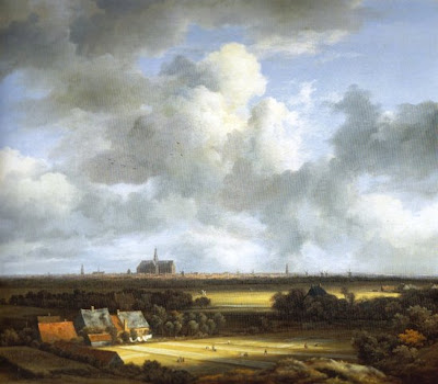
When I was just beginning my journey to become a painter I was enrolled at Oberlin College. At the time its Art Department leaned somewhat heavily toward conceptual and avant gard art. Eva Hesse came as a visiting artist to give critiques to the art students ( I was the only one who showed up to hear what she had to say). Overall the key message I received studying art there was that the most important goal for an artist is innovation. Art from the past was important of course, but our job was to make a new art that boldly asserted its independence from all those outworn conventions.  Trouble was, I didn't really like my paintings very much. I knew I was ripe for change. I went on to Bloomington, Indiana and entered their MFA program in painting. I took a course in Baroque art from the art historian Charles Hasthausen. He liked landscapes and showed lots of 'em. That's when I discovered I loved the Dutch Masters. And still more important, I realized that whether or not I w

Going Ice Skating with Charles Burchfield

Image
One needs to see paintings in two opposing ways. A painting is always a window into space- sometimes deep space and sometimes shallow. But almost never is a painting's space truly flat. Pictorial space draws a viewer into the painter's imagined world. It's a good thing. But carving out the space of a canvas alone can be a one-way ticket from the painting's foreground to its far distance. That alone is never enough to keep a viewer with you. So you have to add the other big ingredient- an elegant design to move the viewer's eye around the painting's surface. When I was a kid there was a neighborhood pond just over the hill from my house where all my friends would gather to skate in the winters. Maybe because I was never very good at the activity I found lots of excuses to sit on the sidelines and watch. I remember so vividly the sound skate blades made as they cut across the ice and the amazing geometry of the tracks they left behind. Some of my friends were

Anatomy of a Painting

Image
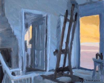
Philip Koch, Edward Hopper's Easel,  oil on panel, 7 1/2 x 10", 2011 In the August 4th post I dissected my oil painting Banner  with a eye toward helping readers to grasp how its space is constructed. Every painting after all begins its life as just a flat surface. The sensation of depth, so palpable in the real world, has to be built by the artist. It doesn't happen all by itself (witness the remarkable flatness of all children's drawings). I wanted to return to Banner to bring out a few more of the ideas in the piece, but first I wanted to show you a small oil I did in the last couple of days as its so much like Banner. It's based one of my on location drawings from my residencies in Edward Hopper's painting studio in S. Truro, MA. This is the easel Hopper used to create many of his most famous paintings. I had done a pastel drawing of his easel standing in front of the doorways made famous in his oil Rooms by the Sea  now in Yale's art museum. While i

How a Painting Evolves

Image
Philip Koch, Banner, oil on panel,40x30", 2011 Here's the newest painting at my show down in Virginia at the Peninsula Fine Arts Center in Newport News (through Oct. 2, 2011). Two days before it was loaded on the truck for the trip to the museum I was up to my elbows painting away on it. There's something about a deadline that quickens the mind and the eye. In the old days when I used a traditional linseed oil medium it would have been delivered still wet, but I switched last year to Gamblin's Galkyd painting medium and the darned thing dried overnight (gotta love modern chemistry!). Below is the source I painted from. It is also included in the Peninsula Fine Arts Center's exhibition and serves as a useful point of comparison. Philip Koch,  Banner,  oil on panel, 10 x 7 1/2", 2008 As long time readers of this blog know, I'm something of a nut about the work of Edward Hopper, an affliction I share with m

Learning to Look with J.W. Waterhouse

Image
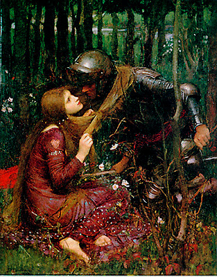
We are born, we live, we die. While we are here it just makes sense to try to genuinely be  alive. Surely that means learning to enjoy our senses to the fullest. Fortunately there's a crash course in just that available free- looking a great paintings. Let's check this one out. Here J.W. Waterhouse (British, 1849 - 1917) gives us a beautiful woman who seems to be ensnaring a noble knight and keeping him from this knightly duties. This could be a cheesy illustration you'd glance at once and then lose all interest in it. But instead it has a lingering and smoldering intensity to it. That's Waterhouse's art working its magic on the viewer.  Notice how Waterhouse divides up his canvas into a warm overall color in the bottom two fifths of the painting and a cooler, darker zone in the remaining top area. The red haired woman in the red dress seems to literally grow up out of the ground. Similarly our errant knight seems right at home as he leans