Anatomy of a Painting
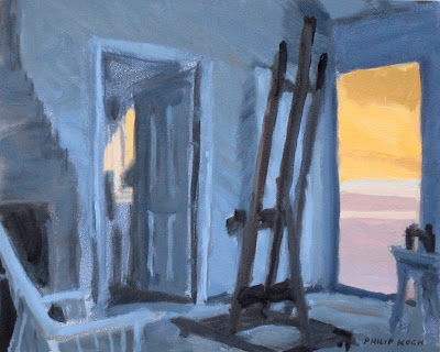
Philip Koch, Edward Hopper's Easel, oil on panel, 7 1/2 x 10", 2011
In the August 4th post I dissected my oil painting Banner with a eye toward helping readers to grasp how its space is constructed. Every painting after all begins its life as just a flat surface. The sensation of depth, so palpable in the real world, has to be built by the artist. It doesn't happen all by itself (witness the remarkable flatness of all children's drawings). I wanted to return to Banner to bring out a few more of the ideas in the piece, but first I wanted to show you a small oil I did in the last couple of days as its so much like Banner. It's based one of my on location drawings from my residencies in Edward Hopper's painting studio in S. Truro, MA.
This is the easel Hopper used to create many of his most famous paintings. I had done a pastel drawing of his easel standing in front of the doorways made famous in his oil Rooms by the Sea now in Yale's art museum. While it served as the launching pad for some of the most remarkable realist paintings in 20th century art, that famous easel itself couldn't be more ordinary. It's identical to the standard wooden studio easels available in any art supply store. I'm reminded each time I see Hopper's pedestrian easel that the magic of painting has to come from the insight and spirit of the artist. Good tools help, but they're just tools in the end.
What struck me about the new painting above is that while it's architecture and not a landscape, it's space is built up in such a similar way. Below is Banner , oil on panel, 40 x 30", 2011 hanging now in Peninsula Fine Arts Center's current exhibition of my work, Unbroken Thread. In both paintings the viewer stands in a darkened foreground space of cool bluish colors and looks out into a more light filled and much warmer distance. Changing the color helps to alter the feeling of each of these spaces.
Space is an emotional issue for us humans, Think of a dream you have had where you're trying to reach a person you're attached to. As you pull closer, your sense of well being surges. Or as the gap between you widens your heart sinks. All the deep themes- safety, intimacy, isolation, vulnerability come to us with particular spatial settings coupled to them. When you build a convincing space in a painting you are building the container into which your viewer can pour their feelings. It's not technical, it's emotional.
One other critical ingredient in both Banner and Edward Hopper's Easel is the emphasis put on movement. In human perception diagonal lines make us feel impending movement. And nothing makes one sense movement better than contrasting something stable and unmoving with something that leans over. Each painting has as a baseline either a clear horizontal (the bright yellow horizon in Banner) or the stately and sober vertical lines of the repeated door frames in Easel. Against these geometric foundations, strenuous efforts are made to make you feel the extra sense of movement implied by moving your eye along diagonal pathways.
Just as an experiment hold your extended index finger out before you and block out your view of just the big leaning tree in Banner. Then in your mind's eye imagine the tree's trunk straightened up to form a true vertical. As you do this the painting seems to freeze over and its energy level plummets.
Look back to the Easel painting. See how the primary straight lines of the easel lean to the right. Similarly the leg of the end table at the right of the door leans to the right as well at just the same angle.
The back of the shadowy chair in the lower left corner leans to the left in direction that is mirrored perfectly in the diagonal edge of the chimney just above it.
In the painting below, the initial version of Banner, 10 x 7 1/2", 2008 you can see I haven't really tried to describe details. The concentration is instead trained on whisking your eye across the painting's surface by emphasizing diagonals and plunging you into the space of the painting by making a background that feels different in color than the foreground.


