Looking at Old Friends
The mark of a really good painting is its ability to keep showing you new things even over long period of time. Sometimes 40 years.
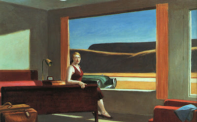
Above is an old friend of mine, Edward Hopper's Western Motel. When I was in graduate school at Indiana University getting my MFA in painting from 1970-72 I taped a postcard of this painting on the outside of my studio door. You could see it from a long way away as you were coming down the hall. The funny thing was I always liked it best when I was ten or more feet out and less when I was close enough to see the details. Still, I kept it hanging there on my door for well over a year.
I'd forgotten all of this until 5 minutes ago when scanning through a pile of Hopper images on Google and a tiny thumbnail of this Hopper pricked my memory. This oil to me isn't one of Hopper's strongest, though I obviously have a nostalgic attachment. What I didn't care for was the stiffness of the figure and the sparseness of the interior. This is an imagined composition, based no doubt on a couple of the long driving trips Hopper and his wife Jo took out west. Constructed entirely from what Hopper could recall from memory and invent in the studio, it feels a little cold.
But even when he was a little off his game, Hopper can be pretty good. What caught my eye this morning was something I must have sensed all those hundreds of times I glanced at that old grad school postcard without being conscious of it. There's a rhythm to the tops of the low mountains in the far distance- one is completely level, then the two just in front of that slope down and then up again. To me the most elegant pass my eye can take over the painting is sweeping in from the right hand side, descending along the first ridge line and riding upwards on the middle mountain. Then jumping to the inside, the top of the sunlight on the wall over the bed cascades downward again. Leave it to Hopper to come up with an ingenious way to knit inside and outside toghether.
My intuition is this was all invented as Hopper painted, sensing his interior and the frame of the windows alone would have felt just too vertical and box-like. It's little things like this that make all the difference in paintings. Check out the little strip of a window at the far right side- I'm guessing that too is an invention Hopper inserted just to let the mountains' silhouettes play a bigger role.
Here's an earlier Hopper that I would have hung on my studio door instead had I been able to fine a postcard of it (sometimes you just gotta settle..). It's Cape Cod Afternoon and its quirky assembling of architectural shapes suggest to me he based it on some drawings he did on site. It's at once too weird to think up while being totally believable. That's a quality one so often finds in Hopper, the simple making of the improbable combinations of shapes and colors look completely possible and delightfully ordinary.
There must be at least 25 separate walls and windows in his pile of barns and houses, yet he pushes them all together as a solid wedge of architecture pushing into the painting from the left. Then to keep the view on their toes, he accents his undulating grassy fields with two extremely sharp triangles of shadows. For my money, there's nobody who could paint a field of tall grasses as well as Hopper. They're soft and solid at the same time. Usually done with little or even no detail at all, they still convey exactly the textural feel of millions of soft, fibrous stalks all standing and waving together. How the heck does he do it?!
One last point- color. Hopper ramps up the saturation of his ochre green grasses almost as far as they will go. Then to contrast that and cool your eye off again, he paints the blue-grey off-white shadows on the right end of the buildings as an island of calm.


